Component 2 Exam Paper
|
|
|
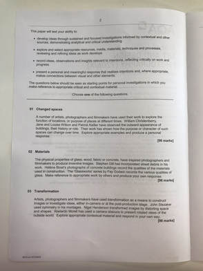
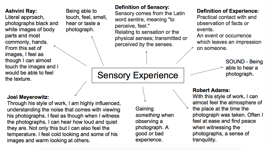
Sensory Experience
"Some photographs have tried to evoke a sense of smell, taste or touch in their work. Images of hands by Ashvini Ray often exaggerate their tactile qualities. Colour photographs by Joel Meyerowitz explore how the temperature of spaces might be suggested visually. Work produced by Robert Adams can allude to ambient sounds and noises. Respond in your own way, making reference to appropriate work by others."
To me, a sensory experience is where something evokes a response out of me. I cannot help but offer some sort of response to what I am experiencing, as if I have no choice. It is often strange to think of photography in relation to other senses other than looking. Because you look at a photograph, you do not hear or smell it. However, through experiencing different photographs and different photographers such as Ashvini Ray, Joel Meyerowitz and Robert Adams, I feel as though my other senses: taste, touch and smell are stimulated. I feel something after experiencing these types of photographs. I feel cold, warm or comforted. I feel like I can hear the noise in some of the photographs and hear the tranquility of others. But I have wondered how the photographers offer this experience.
To me, a sensory experience is where something evokes a response out of me. I cannot help but offer some sort of response to what I am experiencing, as if I have no choice. It is often strange to think of photography in relation to other senses other than looking. Because you look at a photograph, you do not hear or smell it. However, through experiencing different photographs and different photographers such as Ashvini Ray, Joel Meyerowitz and Robert Adams, I feel as though my other senses: taste, touch and smell are stimulated. I feel something after experiencing these types of photographs. I feel cold, warm or comforted. I feel like I can hear the noise in some of the photographs and hear the tranquility of others. But I have wondered how the photographers offer this experience.
Ashvini Ray:
Ashvini Ray, born in Sydney, Australia, completed a Bachelor of Fine Arts in 2011, at Sydney University.
On her website - https://www.works.io/ashvini-ray - she describes her work.
"Ashvini Ray's work merges soft, rounded contours with taut, tightly stressed surfaces to produce works whose materiality reflects the gradual self-manifestation of natural forms. Through a process of the stretching and straining of man-made materials and the use of repetition which aims to infiltrate entire spaces, the work gives a sense of organically coming into existence. Pressure and force converge with a defiance of gravity resulting in a body of work which appears infinitely extendable.
This flirtation with infinite self-manifestation not only recalls the process by which a cell divides and seeks to re-create itself but comfortably fits within the conceptual parameters of synaptic function in the brain, the pathways created unconsciously by the individual in order to assemble time and place. Ray deliberately focuses on aesthetics, leaving the works conceptually open. It is this conceptual openness, which forces the viewer to negotiate their own pathways of association and traverse their own endlessly mutable synaptic function in order to create an individual reading. "
I find Ashvini Ray's work extremely interesting, mainly due to the fact that all of the photographs in the sequence are black and white. I feel that because there is no colour to contextualise the images, it makes the photographs that much more interesting to look at, attempting to understand what body part is being photographed and in what way it's being portrayed. When I witness her photographs, especially the second image in this sequence, I feel comforted as though I am welcomed into a natural, soft form of manifestation. I feel cushioned by the images and comforted by what is presented to me; I think this is partly due to the subject filling the whole frame.


My Response:
When making my response to Ashvini Ray, I made sure to keep in mind the idea of close-ups, lighting and body parts. These are key aspects that I feel really shape and identify her series of work. I really wanted to expand on this idea so I decided to take photos of body parts, using artificial lighting to emphasise the depth of shadows. Because the images are so close up, when I look at Ashvini Ray's photographs I almost find it difficult to identify what the body part is and what angle it is being taken from, this was something I felt I needed to touch upon, taking images that reflected this idea. Overall I am very happy with the outcome, I feel as though the shadows that are particularly prevalent in images one, four, five and six of my sequence, really reflect Ashvini Ray's work and also really link to the idea of affecting the senses. I think that the dark shadows contrasting with the bright light really affect the viewer in a conflicting way. For me, I feel somewhat at ease and at peace when I view the light in the photographs however this is conflicted with feeling almost cold when I look at the shadows in the same photograph. This is something that I have found very interesting when responding to Ashvini Ray as I am intrigued by the way that the photographs I have made, affect the viewer in different ways. When continuing with this project, I will aim to take on the idea that lighting can affect the viewer in different ways so that when I proceed to make more responses and sequences of photographs, I am aware of different ways to affect the viewer and touch upon their senses.


Joel Meyerowitz:
Joel Meyerowitz began taking photographs in 1962. Although he has always seen himself as a street photographer inspired by Henri Cartier-Bresson and Robert Frank, he has also presented his interest in the use of colour in photography. As an early advocate of color photography in the mid 1960s, Meyerowitz was influential in changing the attitude toward the use of color photography to almost universal acceptance from what was seen as resistant. In Meyerowitz’s book, Wild Flowers (1983), he demonstrated a comic-like appreciation for nature and colour on ordinary city streets. More recently, Meyerowitz has spent three years capturing wild areas in New York City's parks. Selections from the project were exhibited at the Museum of the City of New York, and they have been published in Legacy: The Preservation of Wilderness in New York City Parks (Aperture, 2009).
It is clear that Meyerowitz captured the intense colour of the space he was photographing, inviting the viewer into what should be felt when witnessing each photograph. Viewing certain photographs almost taste sweet or salty, you can smell the heat and humidity in the photographs and most of all, you can hear the noise and silence of each surrounding. This is exhibited not only through the space that Meyerowitz captures, but the way he does this. He composes each image (through distance, angle and aperture) in a way that makes you taste, smell or hear what he wants you to. Through this sequence of photographs, I feel as though I can taste, smell and hear each photograph, all in a different way. I am very interested in Meyerowitz' photographs, I think that his style of work is usually something I am instantly drawn to because of the intense, sweet colour.


Robert Adams:
Robert Adams initially started out as a professor of English literature for several years until the mid 1970s where he turned his full attention to photography. Knowing that Adams had a profession in English Literature before photography, I feel as though I understand his style of work work much more than I would if I hadn't of known this. I feel at ease when experiencing these photographs. They withhold a sense of tranquility, peace and in terms of noise, quietness. He took many of his photographs in the suburbs of Denver, documenting the changing of Los Angeles through the 1970s and 1980s. He then photographed the 'clear-cutting' in Oregon in the 1990s. He documented the peaceful side to a what seems a manic place to live in Los Angeles.
You can gather the atmosphere of each place just through viewing a single photograph. I feel something when viewing each and every photograph in this sequence. Mostly peace and tranquility, though. Before researching Robert Adams, I understood the idea of being able to hear a photograph but only to an extent. Witnessing a chaotic, busy photograph with colour and a lot going on meant I could almost hear the loudness of the atmosphere at that time. However, I felt it hard to understand that you could hear the quietness of a photograph, the peacefulness. Through this sequence of photographs, I now understand. I can hear the quietness of each and every photograph.


My Response:
As a response to Robert Adams' work, I recently went on holiday to Canada and decided to respond to his style whilst I was there. I aimed to incorporate his style of portraying what silence looks like. This is a feature I feel is really key to his work. I photographed open spaces featuring elements of nature, making sure I kept in mind the idea of demonstrating what silence looks like. Overall I am so pleased with the outcome of the sequence of images, I feel as though I have really captured the silence in each and every space I photographed. Even in the second and fourth images, where people are featured, I feel that it is still somewhat tranquil and as if they're apart of the silence. The fact that it was heavily snowing where I was, made it all that much better when thinking about silence and space as the snow created the perfect landscape, as if a white blanket was creating a silent canvas.


Further Research
An interesting concept I have thought about is Sylvan Tomkins' 'Affect Theory'. This concept is introduced in the first two volumes of his book 'Affect Imagery Consciousness' (1962). He uses the idea of affect to refer to the "biological portion of emotion", meaning "hard-wired, preprogrammed, genetically transmitted mechanisms that exist in each of us", which, when triggered, spark a "known pattern of biological events". To me, he is referring to everyday experiences that affect us, whether that means we are attracted or repelled, we are affected by them. This is a subconscious emotion and therefore are not aware that we are being affected. These experiences could be as minor as an attraction to the colour of paint on a wall, or as major as being repelled by an unpleasant substance on the pavement. I think it would be interesting to develop this idea through photographs and make images that exaggerate attraction and repulsion.
Inspiration from Torbjørn Rødland:
Torbjørn Rødland is a photgrapher based in Los Angeles, known for portraits, still lives and landscapes. His exhibition: 'The Touch That Made You Smile' emphasise his common way of making the viewer somewhat uncomfortable when looking at the images. The set up, still life images affect the viewer in different ways, for me, I feel slightly uncomfortable and on edge. Through Torbjørn Rødland's work and the 'Affect Theory', I feel that it would be very interesting to create a sequence of images that affect the viewer in some way, attracting them through subject satisfaction or aesthetics, and repelling them in the style of Torbjørn Rødland.
This idea of composing a subject, placing objects and people in certain ways to fulfil the purpose of the image, is something I am very unfamiliar with. I often take photographs of the world as it is left, I do not move anything for the photograph or place anything in a particular location or position, I take a photograph of what is in front of me. A lot of the photographs by Torbjørn Rødland also feature people, again something I am unfamiliar with. Although this is not an aspect of photography where I feel confident, I think it will be very interesting to work with these two elements for a particular purpose, to repel or refuse my viewer. I will use Torbjørn Rødland as great influence for my set of images and take tips from his way of working to help make my sequence.
I wanted to consider Torbjørn Rødland's style whereby almost all of the photographs make the viewer feel uncomfortable. I wanted to manipulate the idea of the 'Affect Theory' and make a sequence of photographs that affect the audience, but in only a negative way, making the viewer feel uncomfortable or on edge, as Torbjørn Rødland does. His photograph of feet (fourth photograph along) from the 'Touch That Made You Smile' project really interested me. I found the substance that was seeping through the tights really uncomfortable to look at and it made me feel as though I could taste what the substance was and what it would feel like on my body. As I felt affected by this image, mainly due to how the substance contributed to


Experimenting With An Idea
I wanted to incorporate Torbjørn Rødland's style in my work; his way of making the viewer feel uncomfortable and almost repelled. I aimed to expand on his photograph of feet that I mentioned previously, using different watery substances on hands and also using a range of other body parts to achieve my intended 'affect'. I used various substances such as PVA glue mixed with water and pencil sharpening's, PVA glue mixed with water and blue paint, and PVA glue left to dry to become tacky. I also tried multiple ways of creating my intended 'affect', aiming to take photographs of squished faces, photographs of feet and photographs of armpits.
I asked people within my class to get their hands dirty in the PVA glue and also the spaghetti hoops so that I could take various snapshots. My overall aim for this experiment was that after I had edited the images, my audience would feel as though they were physically ''affected' by the photographs; whether it affected one of their senses directly so that they could smell, taste or feel the photograph, or they generally felt repelled by what was being photographed, then I had achieved what I wanted to.
I asked people within my class to get their hands dirty in the PVA glue and also the spaghetti hoops so that I could take various snapshots. My overall aim for this experiment was that after I had edited the images, my audience would feel as though they were physically ''affected' by the photographs; whether it affected one of their senses directly so that they could smell, taste or feel the photograph, or they generally felt repelled by what was being photographed, then I had achieved what I wanted to.
To make this sequence of photographs, I asked Reneé to eat crisps that I had brought in, I asked her to chew them and open her mouth as she did, giving me an opportunity to take a series of photographs that would potentially, after being edited, would create my intended repelled 'affect'.


For these photographs, I asked Shakira to not paint her toe nails as she usually would and I asked her to put her feet into unusual positions so that it emphasised and exaggerated the common dislike of feet from the viewer. Because her feet or toes were not groomed in any type of way and she had put them in unusual positions such as interlocking her toes, it really 'affected' the viewer, making them feel very uncomfortable and almost disgusted,


I initially asked Reneé to put her own hands on her face to squish and move it around, however I realised that because you could tell that she was doing it to herself, the impact I had hoped to have on the viewer was not what I expected. It felt too setup and so this impacted the viewer. I decided to ask Sheila to manipulate the shape of Reneé's face as it was clear that somebody else was doing this to Reneé, she was not in control, making the viewer slightly uncomfortable and on edge.


To make these photographs, I mixed PVA glue with water to make a watery consistency and then put pencil sharpening's in it. The intended affect was to make the viewer feel repelled by the dripping liquid and how sticky it looked however I found that after making the photographs, the thing that was the most repulsive was how glossy it looked, the fact that you could almost taste the liquid in your mouth.


Although I had made the previous set of images using PVA glue, I initially wanted to make a series of photographs whereby the glue was tacky and the hands were sticking together, as if the skin was peeling. So after making the first series of images, I moved on to using the PVA glue once it had nearly dried and then asked Reneé to peel it off of her hands in unusual ways so that it appeared as if her skin was peeling off.


I initially wanted to photograph the armpits of girls in my class as I felt the shorter, finer hair of women would be more effective in trying to affect the viewer. However, after some thought I realised that it would be portrayed as a feminist-type action and that was not the affect I imagined, I wanted to focus on affecting the senses of the viewer as opposed to making political movements. Hence I decided to take photographs of Max' armpit. Overall I am very pleased with the outcome of the images as I think the sparse, wispy hair really 'affects' the viewer, I feel as though I can almost feel the hair at my finger tips and taste it on my tongue.


I continued with the liquid substances on hands as I was really pleased with the previous outcomes of the other series of photographs. For these images, I used spaghetti hoops to create my intended 'affect'. I think that because of the common experience of the texture of spaghetti hoops, the viewer is likely to understand that the juice is sticky and the spaghetti hoops are soft and mushy. I think that because the substance is a liquid with bits in it, it immediately affects the viewer, making them repulsed by the bits or hoops sticking to Reneé's hands.


Editing the Photographs
To edit the photographs, I used a black and white filter, demonstrating my influence from Ashvini Ray. I feel that using the black and white filter really emphasises the 'affect' on the viewer, purely due to the fact that there is a sense of enigma and that the viewer doesn't know what is on the hands, making them feel slightly on edge, queasy as to what it could be. The fact that you are still able to identify that the substance is a liquid, and especially in the fourth photograph, you can see how glossy the substance is, it makes you feel as if it is slimy, that if you touched it it would feel sticky on your hands. However, a tranquil and peaceful tone is created from this sequence of images purely due to the black and white filter, and the positioning of the hands.


In the first two images, the fact that you are unable to see Reneé's eyes due to Sheila's hands creating the dark shadow. This makes the image all that more chilling and dark, adding to the already unusual manipulation from Sheila's hands. I am very pleased with the outcome of the face portraits, the images demonstrate a conflict of some sort, as if Reneé is hurt or injured, I think this creates the idea of darkness and 'affecting' the viewer negatively.
The second two images affect the viewer in a way that makes them feel uncomfortable, mainly due to that of the common distaste of feet. I think the fact that the only light in the photographs is directed solely on the feet emphasises what I wanted it to and allows the audience to focus on the subject matter. Again, the contrast between the light and the shadows really emphasises the uncomfortable subject matter, and the way the feet are positioned, affecting the overall outcome of the image.
The second two images affect the viewer in a way that makes them feel uncomfortable, mainly due to that of the common distaste of feet. I think the fact that the only light in the photographs is directed solely on the feet emphasises what I wanted it to and allows the audience to focus on the subject matter. Again, the contrast between the light and the shadows really emphasises the uncomfortable subject matter, and the way the feet are positioned, affecting the overall outcome of the image.


Because I had used the black and white filter, inspiration from Ashvini Ray, I feel that my initial idea for the images of Reneé's hands has been achieved. I initially wanted to create a series of photographs that appeared as though the skin was peeling on the hands. Using the black and white filter has helped to obscure the true material that is on Reneé's hands (PVA glue) and make it seem as though her actual skin is peeling. I think this is really effective as the audience are repelled by what they make of the image and what it means, not what is actually being shown.
I feel that using the black and white filter on the image of Max' armpit was also really effective as the darkness of the hair is made very significant and you are also able to see every detail of the skin. The darkness of the hair and the fact that every strand is made significant, it is as if you can feel each individual hair on your fingertips. Also, because of the viewer's previous connotations of an armpit and the common distaste of it, it is this that I somewhat rely on to 'affect' the viewer as I am fully aware of the common feeling to an armpit.
I feel that using the black and white filter on the image of Max' armpit was also really effective as the darkness of the hair is made very significant and you are also able to see every detail of the skin. The darkness of the hair and the fact that every strand is made significant, it is as if you can feel each individual hair on your fingertips. Also, because of the viewer's previous connotations of an armpit and the common distaste of it, it is this that I somewhat rely on to 'affect' the viewer as I am fully aware of the common feeling to an armpit.


However, when attempting to incorporate Ashvini Ray's style into my own through using a black and white filter, I found that this sequence of images didn't work. In fact, they looked much better when saturated a little. I think this was solely due to the fact that the photographs needed that element of colour for the viewer to understand that it was spaghetti hoops on the hands, and the black and white filter prevented this. The saturated colour intensified the colour of the juice and emphasised the fact that it was almost wrong for it to be played with. I think the saturated colour has worked really well with this sequence of images as opposed to black and white as I think it allows the viewer more context of what is happening in the photograph and can therefore be 'affected' fully to what is being shown.


I had a similar problem with this set of images of Reneé eating crisps. I found that the first image really didn't work when edited to black and white. I think this was due to the fact that the crisps were not very apparent when the image had not been edited, so adding a black ad white filter only obscured what Reneé was eating even more. This ruined the intended affect as the viewer could not feel entirely repelled, as I had hoped, as they were unaware of what was actually going on. I feel that, the first image in particular, looks so much better when the colour is slightly saturated so you can see what Reneé is eating and understand the full context of the image, therefore more able to be 'affected'.
However, I feel the second image works so much better when edited to black and white. Because Reneé has pushed the food out so that it is more visible, the black and white filter does not obscure the image at all, the viewer can still understand what is going on. I really like the softness of Reneé's eyes and nose in the image, I think it creates a peaceful image, however due to the black and white nature and the dark shadows, it creates an eerie tone, adding to the 'affect'.
However, I feel the second image works so much better when edited to black and white. Because Reneé has pushed the food out so that it is more visible, the black and white filter does not obscure the image at all, the viewer can still understand what is going on. I really like the softness of Reneé's eyes and nose in the image, I think it creates a peaceful image, however due to the black and white nature and the dark shadows, it creates an eerie tone, adding to the 'affect'.


My Plan: The Exam
For my final exam, I plan to use the images in my previous experiment to create two different final outcomes.
For my first outcome, I will aim to print five A3 images, all of which have been shown above, as a final sequence to be manipulated with. I will be using various different substances, mostly food, to lay over the A3 prints as a 4D exhibition. This means the viewer's senses will not only be affected by how they feel towards the printed image, but they will also be directly affected by the physical substance. I think smell will be the sense that is affected most and so I hope to take advantage of this when thinking about what liquids and substances I will be putting on top of the images.
For my second final outcome, I will be printing twelve 6x4 images, and experimenting with them in various different ways to make outcomes that affect the different outcomes. I will be manipulating some of the prints so that they will eventually affect the viewer's sense of touch, smell, taste and sight. This will mean the texture of some of the images will be manipulated with, the smell of some will have been manipulated with, the taste of the print will have been manipulated with and the prints will have been manipulated so that it is unappealing to the eye. Once I have completed the experiments, I will be taking photographs of people engaging with my exhibition and portraying how it has affected each and every one of their senses.
