Personal Investigation Part 1: The Photobook
Two Frame Films
Luke Fowler diptychs:
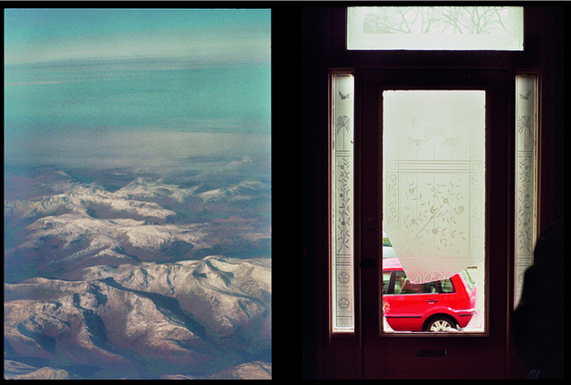
Luke Fowler, born in 1978 is an artist, filmmaker and musician based in Glasgow. He studied printmaking at Duncan of Jordanstone College of Art and Design in Dundee. He creates cinematic collages and has recently created a photo book named 'Two Frame Films', featuring this diptych:
Similarities:
- Both photographs are similar in the fact that they are both taken from a window; the left is taken from a plane window and the right is taken through the broken window on the door.
- The lines that line the mountains in the left photo are very similar to the jagged lines of the broken window in the right photo.
Differences:
- The colours in the photographs are very different; the left consists of pastel, faded colours such as the light blue mixing with the white whereas the right photograph consists of bolder and block colours such as the vibrant red of the car and the dark brown of the wood of the door.
- The spacing within the photographs is also very different; the left photograph portrays a wide-angled shot, being able to see far past the mountains whereas the right photograph is very enclosed as it photographs the short space of the hallway.
- The left photograph is very natural as it is an image of mountains whereas the right photo is more urban.
- The left photograph consists of rough and random lines as it is the lines of the mountain that is natural whereas the right image contains more structures lines: horizontal and vertical.
Diptych Photographers
John Maclean
Osma Harvilahti created his series of diptychs on a trip he went on to Africa. His diptychs often use colour and shape to create links between two photographs. We can see this in the first photograph of the man paired with the image of the fruit. The two are visually linked together by the colour of what the man is wearing and the colour of the fruit. I really like the way Harvilahti uses visual aspects to create his diptychs and when making mine, I will hope to do the same.


Katie Orlinsky
Katie Orlinksy's 'Spring/Thaw' diptychs present two images that completely juxtapose each other. She photographs the same scene at different times of the year. We can see this in the first photograph whereby she has photographed a shack in the winter time, with snow covering the ground around it and then the juxtaposing photograph next to it, taken in the summer time whereby it looks like it is in a desert. This is a very interesting style of diptych making as you are able to look at the same subject in the photographs however the photos look completely different due to the time of year.


Making my own diptych in photoshop
- First of all, I selected two images that I wanted for my diptych.
- I then dragged them both into photoshop and checked the size of them by selecting the whole image (cmd a) clicking image > image size > then checked the height of the image as only the height would matter because my images would be placed next to each other.
- After checking the image size of the other image, I realised that it had a height of 600 pixels compared to 574 pixels of the other image. To ensure they were the same size, I had to change the size of the second image to match the first with 574 pixels.
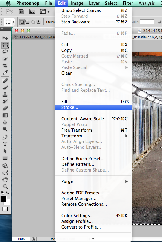
- I then put a boarder on the first photo by selecting the whole image (cmd a) then clicking image > stroke and then making the size of the boarder 20 pixels. I then repeated this process on the other photograph so that both images had boarders of the same size.
- After repeating the process on the second image, I proceeded to put the images next to each other. I done this by selecting the first image (cmd a) then clicking canvas size, changing the width measurement to percent so that it was easier to understand, then doubling the percent from 100 to 200 so that there was room to copy and paste the other image next to it.
- I then selected the whole of the second photo (cmd a) then selected copy, switched over to the first image, then pasted it next to it. I had to drag it over as it pasted half onto the other image.
- After adjusting the size, I saved the diptych by selecting file > save as then changing the format from psd (a photoshop file) to a jpeg (a file that can be accessed anywhere).


More of my diptychs:
When making my set of diptychs, I decided to put photographs together in the style of John Maclean's colour/tone diptychs. I am very happy with my set of diptychs as I really think the colours worked well together with the fact that there is a bit of each colour in each set of diptychs. Especially in the second diptych, I really like how the


Assessment challenge
This is the outcome of my attempt at the challenge set to create a sequence of photographs that told the story of "please, please, please let me get what I want". At the start of the challenge, I found it very hard trying to figure out what I wanted my outcome to be. I was unsure with how I would take the photographs so that they all linked together in some way so I decided to brainstorm my ideas instead of just going straight into the deep end with taking photos straight away. I brainstormed my ideas by thinking of all the ways I could tell a story with the title "please, please, please let me get what I want". I then had the idea to tell the story of someone who does not get what they want so decides to rebel by not doing what they are supposed to. From this, I decided to take photographs of different objects or scenarios that did not conform to the norm so that it would create the idea that the person is rebelling in order to get what they want. I attempted to take photographs in this way by following the instructions on the page however I decided after having attempted it that I did not want all of my photographs to be the same. I then decided to look in some photobooks in order to give me some inspiration as to what I could do with my story. This is where the fifth picture in the sequence; the photograph of the girl looking into the camera with chaos all around her, came from. I really thought this photograph displayed the meaning of the title "please, please, please let me get what I want", so I decided to base my sequence around this photograph. I then thought to develop my initial story idea further so that the idea would be based on a girl who has been told she cannot get what she wants and so kicks up a storm in order to achieve her goal. The whole sequence shows that the girl has been told she cannot get what she wants as shown in the first photo whereby I have captured the lyrics from the song titled 'you can't always get what you want', then in the second photograph; she is clearly not used to this and so is a bit confused as shown by the distorted portrait, then she feels as though everything is wrong and not normal shown by the fact that the shoes in the third photo are not conforming to a certain pattern, then in the fourth photograph she has kicked up a metaphorical storm however a real storm is displayed, in the fifth photograph it shows that she has completed her work of trying to get what she wants as shown by the chaos behind the girl in the photograph, and in the final photograph she is a happy girl as she has finally received what she wanted, this is shown by the smile on Sheila's face.
In order to improve if I complete a similar challenge again, I would read all of the instructions very clearly so that I do not ask questions that I already should know the answer to. I would try to take more risks by thinking outside of the box instead of playing it safe with my ideas. I would try to tell a story not so obviously so that people have to read between the lines of the photographs to understand the story.
In order to improve if I complete a similar challenge again, I would read all of the instructions very clearly so that I do not ask questions that I already should know the answer to. I would try to take more risks by thinking outside of the box instead of playing it safe with my ideas. I would try to tell a story not so obviously so that people have to read between the lines of the photographs to understand the story.


'What I notice in a day' - Challenge


Playing with order of my photos:
|
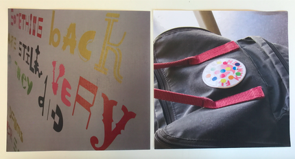
I decided that these two photographs worked really well as a diptych because of the colours. The colours of the writing in the left photograph correspond with the colours of the stickers on the bag in the right photograph. This links to Osma Harvilahti's work whereby he chooses his diptychs based on the colour and tone.
|
|
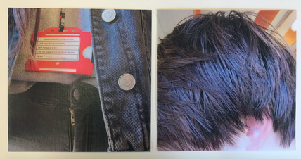
These two photographs were taken out of my final five due to the fact that I didn't think either of them worked well in the final sequence. However, I do think that they work well together due to the colour of my jacket in the left photograph, corresponding with the light reflecting off of the hair in the right photograph.
|
|
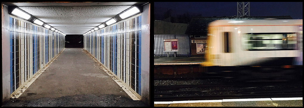
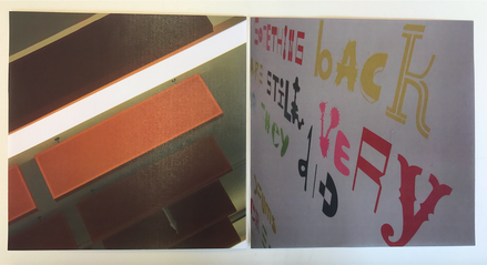
I thought these two photographs worked well together due the the lines meeting when put next to each other. The lines of the light and the baffles coming from the ceiling in the left photograph meet to the lining of the writing in the right photograph. This links to John Maclean's work whereby his photographs correspond through the shapes.
|
|
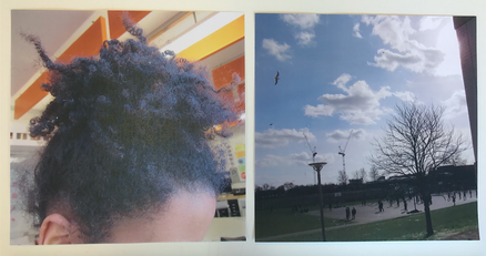
I also though that these two photographs worked together well as the shape of them again corresponds. The messiness of the hair in the left photograph corresponds to the branches of the tree in the right photograph.
|
Final sequences:
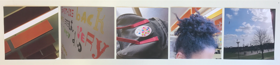
This is my first final sequence of five photos. I chose these photos out of all of the rest because I think that they all work really well together as a sequence. Went taking the photographs, I really thought about how I wanted the sequence to turn out as a whole piece. I wanted the photos to tell a story of my day and almost come across quite poetically. However I think due to the composition of some of the photographs such as the one of the hair I don't think it demonstrates a poetic/daydream story that I had hoped to achieve. From the far left photograph of the baffles coming from the ceiling, to the far right photograph of the trees. The far left photograph works really well with the next photograph in the sequence as the lines link up well when placed next to each other. The second photograph also links well with the next photograph as I said before, the colours of the writing correspond with the colours of the stickers on the bag. The third photograph works well next to the fourth photograph because of the circular curls of the hair corresponding with the dotted stickers. Finally, the fourth photograph works well next to the last photograph as I said before, the hair mirrors the shape of the branches on the tree. The whole sequence works really well in terms of colour and tone. The sequence starts off with a warm, orange tone and then ends with a cool, blue tone. If I were to do this challenge again, I would try to make my photographs so they told the story of how I initially thought of them and I would also try to take more photographs so that I had more to play with at the end.
This is my second final sequence of five photos. I chose to put these photographs together as although I prefer the sequence of the other photographs, I think these photos tell the story of my day and a poetic type daydream due to the fact that they are all close-ups showing the fact that the subject of the photograph was the only thing on my mind was focused on at that point.


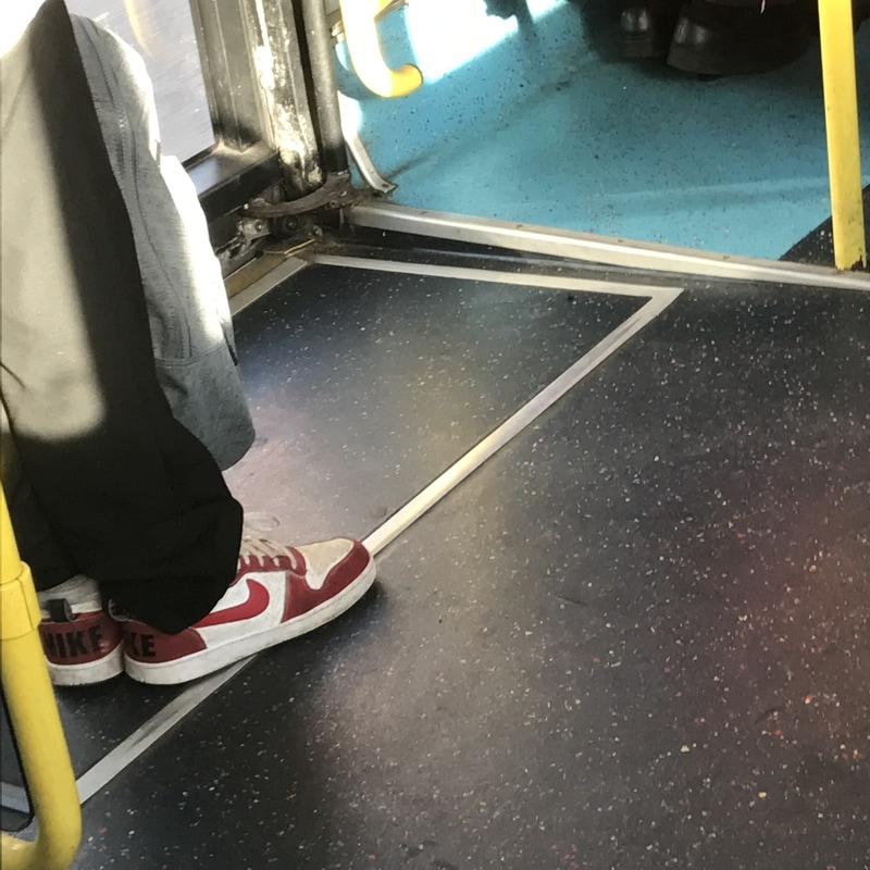
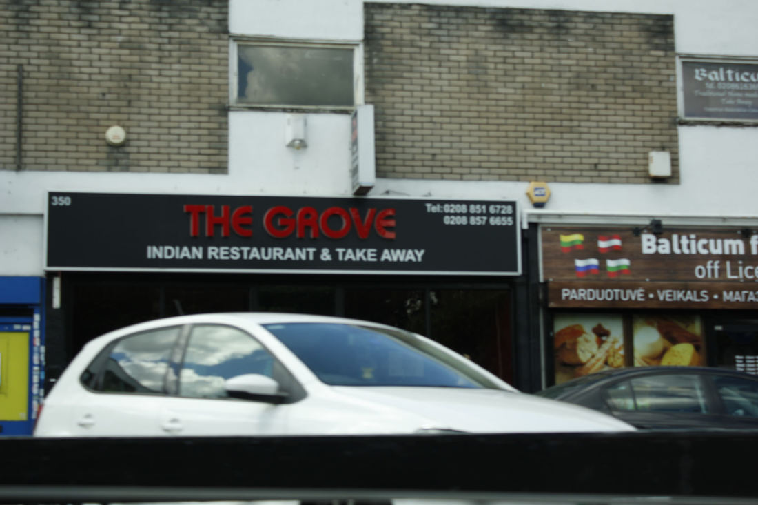
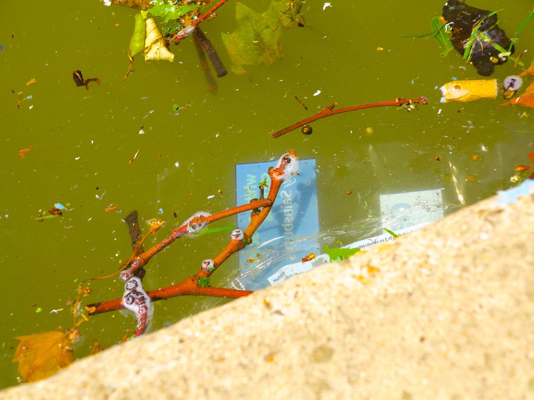
The List - Challenge
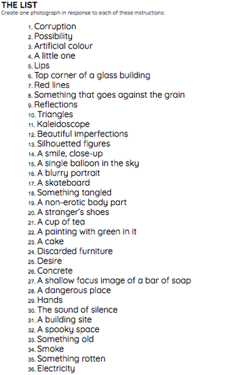
|
This project was based on making a sequence of 36 photographs from each theme on the list. Each pupil in the class, including myself, had to input two themes for a photograph and then we put them together as a class to make the list. We had a week to complete our series of photographs and then once we had taken them all, it was down to sticking them up on the wall as a whole exhibition.
At the start, I thought it was going to be very hard trying to get a photograph for each one due to some of the themes such as 'a single balloon in the sky', this was because I took the idea literally, thinking I would have to take a picture of an actual ballon floating in the sky. I soon realised that this project was all about interpretation therefore you could interpret the images in any way you liked. This made the process a lot easier for me. However, I did find some of the themes on the list hard to take photographs of due to the fact that they were too open, leaving me with too much choice. This was the case with 'corruption' and 'possibility' because they were not specific enough for me to take an easy photograph of something. I interpret 'corruption' and 'possibility' in many ways so it was hard trying to take a photograph of something that really emphasised my interpretation of them. |


"Travel to a place you have never been to before, photograph what interests you." - My Instruction.
When I first read my instruction, I initially thought that it would be relatively easy as it did not require me to buy anything, go somewhere I couldn't or make a photo that would be impossible due to lack of resources. It simply required me to go somewhere I hadn't been before and take photos of things that interested me, as I would do in any case when taking photographs. After thinking about what I was going to do for my instruction and where I was going to travel to, I realised that it was actually going to be quite a challenge trying to find somewhere I have never been to before. I thought about it and realised that it couldn't be anywhere close to home nor anywhere that I encounter everyday so it would have to be somewhere far away. I then thought to photograph a place in London as I have always been interested in photographing London and there are so many places that I have never been to before. A couple of days before I was planning to travel to London to photograph for my instruction, I went to my friends house that I had never been to before and saw that her garden was really interesting. I asked to go out and found that I wanted to photograph her garden for my instruction. The thing that interested me most about her garden was that there was so much usual decoration. It was very old and retro looking which I found very interesting when photographing. I am very happy with the outcome of my sequence of photographs as I think all of them together work really well. I think individually they are good photographs as I think that the composition of them is good in terms of what I have tried to include in the photographs, however I think the photographs as a whole work even better. I really tried to work on my composition in this challenge as in previous challenges I feel as though composition has let me down. If I were to take photographs for this instruction again, I wouldn't change much. I would maybe try to take more photographs so that I had more to reflect upon and I would try to go somewhere a bit further away from where I photograph usually to find differences in what I am taking photographs of.


The Photobook
The photobook is a very important platform in photography. It allows photographers to demonstrate their work in the way they like and manipulate the way that people view it. As Aron Morel and Hannah Watson said - "The book is the ultimate space for the photograph" - suggesting that the space whereby the photographs are placed can sometimes be more important than the actual photograph. This idea is also suggested in the British Journal of Photography - "book-making rather than the simple creation of photography prints is now the dynamic area of modern photography". A photobook can be interpreted in anyway the audience wishes. The photographer and author of the photobook may choose the arrangement of the photographs however that does not determine the way in which the reader reads the book. They may choose to flick onto a random page and then read backwards, or they may choose to read the first half backwards and then the second half forwards. There are no two ways that the reader can read a photobook. This idea means that photographers who publish a photobook ultimately have to understand the the book is just a space for their photographs and the reader decides how they interpret the collection of images, they ultimately experience their own story featuring the photographers photographers.
Analysing Photobooks
Noir - Martine Stig:


I chose to analyse this photobook as I was initially struck by the bright yellow of the cover, and then realised that it was black and white photography which I am really interested in.
The front/back cover - in french, 'Noir' translating to 'black' in English.
- in the top left corner of the page and is not positioned equally from the top and side margin. This shows that
the pictures within the book could be the same, not following a set rule.
- there is one photograph chosen for the front of the cover, filling up the whole bottom half of the page.
- the book is portrait, soft back and the texture of the front and back cover was similar to art paper.
- the back cover is very plain, with the repeat of the author and a featured photograph.
My initial thoughts - I was a bit confused by the title as it was a bit strange that the title was naming one colour; black, but the
colour of the actual book was another colour; yellow. This told me that the photobook would contrast a lot.
- the positioning of the title also instantly told me that the photobook itself was going to be a bit odd in the way the
photos were to be arranged.
- the one photograph chosen for the front page also seemed a bit odd as it did not seem to be something of any
significance, especially to the title.
- the fact that the photobook did not have any page numbers meant that, for me, the author was trying to tell me
that they wanted me to create my own individual experience with the book.
Story/theme - after having flicked through the photobook, I was able to identify that all of the photos were in black and white, and all
of the photographs included the colour black, corresponding to the title 'Noir'.
- there was no pattern or asserted sequence in the arrangement of the photographs, the number of photos per page
varied, telling me that the story trying
to be told was confusing and messy.
- almost all of the photographs entail everyday life, telling the story of reality in Amsterdam, which is made evident to
the reader at the back of the photobook.
Opinion - overall I really enjoyed reading the photobook as it included images that I found really interesting.
- I really liked the way the photos were arranged and the choices made by the author.
- the photobook was very simple with little writing but still told a story of reality which really inspired me.
The River Winter - Jem Southam:


I chose to analyse this photobook as I have always been interested in scenic photography and so this was something I was interested in looking at in depth.
The front/back cover - the title is above centre on the front cover in a small font with a navy canvas background. This could mean
that there is not to be a lot of text within the book itself and the photos may be presented plainly.
- the colour chosen for the book is a very dark navy, quite a gloomy colour showing that the photos inside may
be gloomy themselves.
- the book is landscape, relatively thick and has a hard back.
- the back of the photobook was the same as the front except the word 'mack' was placed bottom centre..
My initial thoughts - I initially thought that the photobook would be telling a story as the blurb told me that the photographs were of
Cornwall.
- the front cover looked very eerie and spooky and so that made me think that photographs were going to be the
same; hard to read.
- the title of the photobook made me think that the whole book would be following a journey to 'the red river'.
Story/theme - after flicking through the book, I realised that almost all of the photos were scenic and told the story of Cornwall very
well through the photographs of the scenery.
- majority of the photos were very gloomy, corresponding to my initial thoughts of the front cover.
- the sequence of the photos was very consistent, this told me that the author did not want the reader to experience the
book in lots of different ways, they wanted all of the photos to conform to a set sequence that the reader should
follow.
- there was only one photo per page in the whole photobook which again told me that the author believed that every
photo was as important as the next so some should not have a double page nor share a page with another
photograph.
Opinion - overall I was very intrigued by the photobook and the story that was told.
- I really enjoyed reading the book I am very interested in scenic photography, especially photographs that seem so realistic
and bog standard, this is because they influence me the most, I believe that it is very hard to take a good photograph like
this.
- I really liked the fact that the author made the choice to put poetry with some of the images.
- I also liked the fact that all of the photographs told the life of Cornwall realistically.
Home and Abroad - Martin Parr:


I chose to analyse this photobook as it is in the style of street photography and I am massively interested in looking and observing street photography so I decided that this book would be perfect to analyse.
Front/back cover - the title of the book is at the bottom of the page, typed to the left and the authors name is above with a central
typing.
- the photograph on the front takes up most of the page and the writing is typed against a different background to
the photo, this suggests that the photograph on the front may tell the reader a lot about what the book is about.
- the back cover is bright yellow with no pictures, just the information about what the photobook is on.
- the book is landscape with a soft back.
My initial thoughts - my initial thoughts were that the photographs in the book would be spontaneous, this is because of my first
impression of the front cover; it does not seem as though the photographer prepared fully to take the
photograph.
- I also thought that the photographs were going to be very similar to Nick Waplington's, this is because the
photograph on the front cover entailed the same sort of affect and composition as Waplington's work.
Story/theme - after having flicked though the book, I found that the photographs were, in my opinion, very similar to Nick
Waplington's work.
- the photographs taken on Parr's journey described a realistic way of life and it seemed as though he took the
photographs very spontaneously without preparing for each one.
- there is also a small description of where the photographs were taken which demonstrates the fact that the whole
photobook is based on a journey.
Opinion - overall I really enjoyed reading this photobook, I think out of all of the books I have read so far, this is the most like the sort
of photography I enjoy.
- I really liked the fact that although the photos were taken in completely different places, they all linked together in some
sort of way.
- the way the photographs were all produced in a spontaneous way really interested me as I really enjoy photography that
captures a realistic way of life and, to me, a spontaneous photograph is the best way of capturing reality.
Utatane - Rinko Kawauchi:


I decided to analyse this photobook as it appeared very poetic and soft which interested me as I love looking at a sequence of photographs that tell a story.
Front/back cover - the title of the book is at the bottom of the page, written in Japanese, translating to the title 'Utatane'.
- the photograph used for the front cover helps the reader to understand what the photographs inside are going to
be like as it is very poetic and soft.
- the colours in the photograph are very soft which may be intentional as Kawauchi may want this poetic
atmosphere to be created from the offset.
- the fact that there is only one photograph used for the front cover could suggest that Kawauchi wanted to engulf
the reader into the main photograph so they are engrossed into the one particular image.
My initial thoughts - initially, I thought that the images within the book would all flow together nicely, with soft colours and a poetic
sequence. I based this first impression off of the front cover image.
- I also thought that the photos would tell a story as I flick though, this was, again, based on the front cover and
how the colours and placing of the photograph worked together.
Story/theme - the main story or theme that really popped out to me was the fact that Kawaushi was photographing everyday
occurrences however making them appear a lot more poetic than they usually would.
- all of the photographs included soft and faded colours with no bold or striking colours. I assumed this was because
Kawaushi wanted to uphold the poetic nature of the photographs.
Opinion - overall, I really enjoyed reading this photobook. This was because it was unlike something I have ever really read before
and gave me a completely new outlook on photography.
- it gave me a new outlook as usually I am to make photographs look quite grungy and rough but this photobook showed me
that I am also very interested in making photographs look elegant and poetic.
Travellin Tree - Ayako Mogi:


I decided to choose this photobook to analyse as I was intrigued by the front cover photograph as well as the quick snapshot I saw of the photographs inside.
Front/back cover - the title of the photobook as well as the authors name is printed at the bottom in the centre.
- the photograph chosen for the front cover is taking up half of the page and the colour of the book is white.
- the photograph is of a wall with part of a window cropped into it, it almost has a warm, cozy feel to the picture.
- the simpleness of the front cover makes it seem as though the book itself will include quite easy looking
photographs that are aesthetically pleasing, not photographs that will be uncomfortable to look at or hard to read.
My initial thoughts - initially I thought that the photographs would be quite poetic and easy to look at and analyse however after
flicking through and landing on random pages, I found that many of the photographs were very strange but made
me want to read on.
- I also thought that the tone of the photographs within the book would be very warm and the colours would be
contrasted. My initial thoughts were right in terms of this as all of the photographs conformed to this style.
Story/theme - the main story or theme I depicted from this photobook was the fact that Mogi was very interested in photographing
nature and everything natural. We can see this in some of the photographs above whereby the images are portraying
different seasons and the natural world with shadows and animals.
Opinion - overall this was my favourite photobook to analyse as I really enjoyed looking at all the photographs Mogi had included. I
was very much intrigued by the tone and colouring of the photographs as well as the subject matter.
- I also really liked the fact that the photographs were all played out in different ways whether it was landscape, one photo
per double page, two photographs per two pages or half a photograph a page.
The making of my photobook
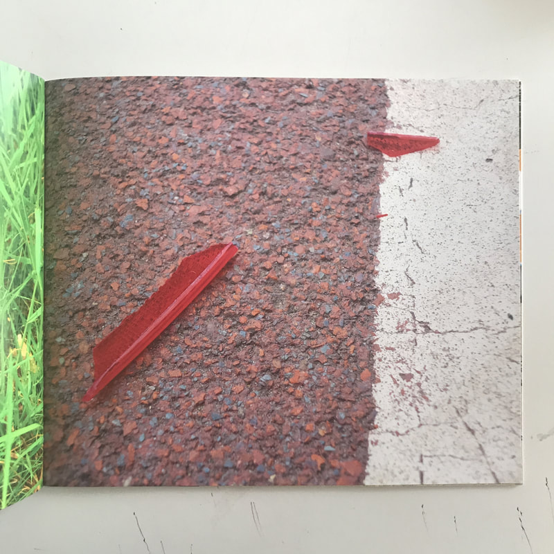
After brainstorming ideas I was sure that I wanted to portray colour within my photobook. I knew that I wanted to enhance the colour and make something that would ordinarily be looked past and transform it into something that people would take a second look at. Although I was sure about colour, I really had no idea about what type of photographs I wanted to make nor in what style of photography. In the end I decided to just go out and take photographs of what I found interesting. This way I could find a pattern in how I liked to photograph and so I could continue this when making more photographs. I always knew that I was interested in photographing rubbish and discarded items on the street so I knew that in my compilation of photographs, they would include a lot of this.
Taking and editing photos for my photobook:
After having taken almost all of the photographs, I was happy with some. I found that I was drawn to the ones with bright and bold colours and also the close-ups. There were few non-close-up photographs and from this, I found that, really, I didn't like the photographs that were not close-up as I didn't think they were in my style of photographing. I think this challenge really helped me to discover what sort of photographer I am and now I can justify that I enjoy taking close up photographs with little context. I also found that the photographs looked a lot better when they were placed next to each other, as apposed to on their own. When it came to physically taking the photographs, I found myself trying to crop out the context in most of the photographs I took and focusing on a particular issue or subject, I was not very interested in taking photographs where a lot was happening. I also found myself taking photographs that had a unusual composition. I tried not to take photographs bog standardly, I wanted to make sure the subject within the photograph was portrayed from an unusual angle. When it came to editing the photographs, I focused a lot on the colour. I wanted to create a saturated theme within the sequence of the photographs. I was very interested in the bright, vibrant and bold colours in the photographs and so when editing, I really tried to enhance this. I done this by strengthening the saturation in all of the photographs and brightening them as well, this made the colours stand out even more.


The final cut:
I chose these photographs to be the final 18 included in my photobook. This was because after a long time of analysing each photograph individually and with others, I found that these images worked best together. When choosing which photographs I wanted to be in the final photobook, I made sure to really look at what photos would work well against others as I think a big factor contributing to a good photobook is if the photographs work well together, against others, not just the photo on its own. These photographs all had the same thing in common; rubbish. They also all were taken with similar compositions and when put together in a sequence, you could see the similarities between all of them. I think this sequence of photographs really show what type of photographer I am and has helped me to define my style in photography. We can see this through the consistency in vibrant colour, composition, close-ups, angles and subject matter.


Editing and placing my images together:
After having looked at all of the photographs that I decided that made the final cut, it was then down to looking at what photographs looked well together in terms of colour, composition, and subject. I decided that because I had focused so much on colour when taking my photographs and then when editing them, then it would only be right of me to place certain images next to each other based on the colours involved. I wanted to have photographs that really contrasted each other as well as photographs that really complimented each other. Photographs that were almost the same in terms of colour, texture and pattern I decided to place next to each other and then photographs that were completely contrasting in those same aspects, I decided to place next to each other. This meant I was left with a variety of of diptychs that, in my opinion, really helped to compliment each photograph in the sequence. I found this part of making my photobook as the hardest, this was because I became very indecisive with what photographs I thought looked best with what. I overcame this issue by asking for my peers opinions on what they thought looked best, and also by trying multiple ways of putting photographs together so that I could make a thorough decision. I also went back to this process every couple of hours and days so that I could refresh myself of what I thought looked best.


Making a physical maquette:
I made the physical maquette by printing off the photographs I wanted to include, then sticking them to white pieces of paper, back to back in order to make a physical book. I printed the photographs out as an A5 size and then cropped them down some more so that the book was not too big. It was very helpful to have made a physical maquette as it made it easier to look at what photographs really did work well together and understand how the sequence of photographs would look in a book form. I often think that photographs can look very good in a digital form but once printed, it really shows how they look. I also think that looking at photographs in a digital form, you can't understand how they are going to look in a physical book form and although the maquette is not the final piece, it gave me a good idea of how the book would turn out.


Final Outcome - Evaluation
Overall I am very pleased with the outcome of my photobook, I feel that the original idea I had for the photobook was really portrayed throughout the sequence of photographs. The idea to portray rubbish and abandoned materials in a way that you would not normally take a second look to, was what I wanted to really make evident in my sequence of images and after a full evaluation of the images individually and together, I think I achieved this. I aimed to transform the "rubbish" into something vibrant, and interesting to look at. I tried to do this by enhancing the colour and saturation of the photographs and I feel that this is was a success! I wanted to make something more of the everyday and give more attention to what we do not usually pay an interest to as well as making more of the colour and subject of the images to change the mood of the photography.


Teacher feedback
This is a witty and entertaining book that is announced by the twin titles 'Taste the difference' and 'A series of rubbish photos'. I really enjoyed exploring the details of the discarded objects and liminal spaces you have photographed. As a fan of the abandoned and marginal, this appealed to me in terms of subject matter but I also appreciate the care and attention you have given to things in the world through photography. You have noticed the beauty in the everyday and made very successful images out of it. I like the rhythm of the book, the selection and sequencing of images. The layout works well although I'm not convinced by the one bit of text on a page towards the end. The full bleed images work particularly well. I feel as though this might be something of a breakthrough for you. I really look forward to seeing how you will develop these interests in your personal investigation. This is a successful book. Well done.
