Personal Investigation Part 2
Threshold Concepts
Threshold Concept 4: Photography is an art of selection rather than invention
|
Threshold Concept 4 is something that I feel has great relevance to me as I constantly think about this when photographing and editing. I think this Threshold Concept can be interpreted from different angles, but the way I often think about it is in terms of framing. Photography is about selecting what you want to photograph in the world than inventing something to photograph.
I often find myself photographing close-ups, taking something out of the world that I find interesting and cropping it so that I am just photographing that one thing. I often photograph still life, one object or subject in a photograph, not a landscape or image that has a lot going on. I take something and frame it away from its surroundings, from its home, and I depict this one thing so it becomes its own interest.
Photography is unlike other visual arts in that it begins with a world full of things rather than with a blank slate. However, photography is also an art of production, not just reflection. It does things to the subjects it represents.
"The painter constructs, the photographer discloses." - Susan Sontag
|
Peter Fraser
Peter Fraser was born in 1953, in Cardiff, Wales and was given his first camera at the age of 7. After initially dropping out in his training of Civil Engineering, he began studying photography at Manchester Polytechnic at the age of 19 and graduated in 1976. He then proceeded to graduate in 1976. In terms of inspiration in style of work, Fraser gained a lot of his inspiration from various opportunities he encountered. These opportunities included working at the Laurel Photography Bookstore in New York which 'expanded his sense of photography’s expressive possibilities'. Another major inspiration for Fraser was William Eggleston. After working in an exhibition with William Eggleston, the most influential pioneer of colour photography, he was then given the opportunity to spend almost two months with him in Memphis, USA in the summer of 1984. This was very important for Fraser as it helped his style in his photographic career and confirmed for him 'the desire to commit his life to working with colour photography.’ He then worked on several series of photographs, leading to a first publication, ‘Two Blue Buckets’, which won the ‘Bill Brandt’ Prize in London, in 1988.
He moved to London in 1990, leading to several new bodies of work, including ‘Ice and Water’ 1993, ‘Deep Blue’ 1997, ‘Material’ 2002, and ‘Peter Fraser’ (Nazraeli Press) 2006. Peter Fraser has taught widely in the UK on Photography and Fine Art courses at all levels in since 1982. He has given presentations in various major venues such as the Manchester City Art Gallery and Tate Britain, and has hosted workshops in the UK, Italy and Spain.
He moved to London in 1990, leading to several new bodies of work, including ‘Ice and Water’ 1993, ‘Deep Blue’ 1997, ‘Material’ 2002, and ‘Peter Fraser’ (Nazraeli Press) 2006. Peter Fraser has taught widely in the UK on Photography and Fine Art courses at all levels in since 1982. He has given presentations in various major venues such as the Manchester City Art Gallery and Tate Britain, and has hosted workshops in the UK, Italy and Spain.
Gallery of my favourite images of his:


Visual: The Formal Elements
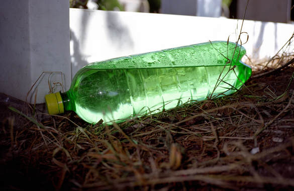
Focus: The image appears to have various layers to it in terms of focus which indicates that a larger aperture was used, meaning a
smaller depth of field, hence only the bottle eally being in focus.
Light: The fact that the photograph is taken outdoors, indicates that the light shown through the bottle and on the wall behind is
natural and not due to a flash or artificial light.
Line: This photograph consists of various sharp lines. The parallel lines of the bottle and the opposing diagonal water line instantly
grabs the audiences attention, and also the line of the wall helps to compliment the water line of the bottle as they are almost
parallel to each other.
Repetition: The parallel lines of the water bottle and the correlation between the water line inside the bottle with the wall show
repetition, which contrasts with the small lines of the bedding of sticks that the water bottle is on.
Shape: The main subject, the water bottle resembles a geometric type shape along with the the shape that is made from the lines of
the wall however this contrasts with the roundness of the edges of the water bottle and the shadows behind.
Form (3D): The main indication that the water bottle is 3D is due to the light reflection off of the water inside the bottle as well as the
angle of the image as it shows the edge clearly and makes evident of the fact that it is not 2D.
Space: The fact that the sticks at the foreground of the image shows that there is some depth of field however there is no indication
that the wall behind the water bottle is far away so there is little space within the photograph. The water bottle also takes up a
lot of the image, showing that within the frame there is not a lot of room.
Texture: The rough texture of the bedding of sticks really contrasts with with the smoothness and lightness of the water inside the
water bottle.
Tone: The tones of the image really compliment each other with the dark but warm brown of the sticks and the bright but also warm
green of the bottle.
Colour: The colours of the photograph really contrast each other with the vibrant green and the dark brown on a background of
white.
My response to Peter Fraser's work:
When responding to Peter Fraser and his work, I really tried to grasp the technique of using flash when it was already light as I think this is a key feature to Fraser's work. I think Fraser's work is quite similar to mine so I did not find it too difficult trying to photograph in the same way as him. A lot of Fraser's images are close ups and as I already enjoy and feel confident taking close up photographs, I felt it was best to focus on reinventing his close up images. Although, I do wish I had taken more photographs from a reasonable distance to challenge myself and not stick to one theme. Overall I am very happy with the outcome as I think it is a clear response to the way he works and my sequence of photographs really show where my inspiration is from.


Gerry Badger's essay: Eventually, Everything, Connects
|
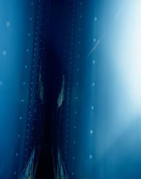
1. How does the author describe his experience of seeing this photograph for the first time?
Gerry Badger describes his initial experience of Peter Fraser’s image: 'Hirwaen, South Wales', as a ‘series of mixed emotive moments’. He described his first thoughts as surprise, then bafflement and incomprehension. He then went on to say that his thoughts were quickly replaced with pleasure and admiration as he felt Fraser had created a moment of epiphany within the photograph. He described this feeling as, what James Joyce said, when the ‘whatness’ of a thing is revealed. This feeling may have been felt by Badger due to the mystery of the photograph. The fact the photograph consists of every shade of the colour blue creates depth and mystery, therefore creating a barrier between the reader and them initially discovering the ‘whatness’ of the image. The sense of pleasure felt soon after may be because of the realisation of the ‘what’. |
2. According to the author, what is Peter Fraser’s relationship to the objects he photographs?
Badger describes Peter Fraser’s relationship with the objects he photographs in a completely different way to William Eggleston’s. Badger describes Eggleston’s relationship with the objects he photographs as working through the object, preserving its integrity and honesty, not allowing anything to obstruct the sincerity of what it is. Peter Fraser, however, is described to be working around the object, not go through it. His importance doesn’t rely so much on the subject matter or object he is photographing so much as it does with William Eggleston, in fact his true aim is to really go beyond the object and find importance around it. And as we can see with this photograph, this is a true representation of that. We are unable to even identify the object being photograph however we find much importance through other factors other than what it is, I think this is what Badger is trying to describe in Fraser’s work.
3. What does the author say about the nature of Peter Fraser’s practice? What interests him?
Badger initially identifies how we can see from Fraser’s work how interested he is in allusion. Suggestion rather than explicit meaning. He likes to take mysterious photographs and work around an object in order to gain allusive content. However Badger also identifies how the voice of the allusion in his work only becomes clear after bodies of work have been made so the reader can grasp a clearer idea of the true meaning. It is also made evident by Badger that Fraser’s work is not only intensely personal, but also very exploratory and experimental. We can see this through the nature of his work, in how his interest in science and nature of materials means that the outcome of his photographs are very abstract and signify the elements of exploration and experimentation.
4. How is the final quotation from Charles Eames “Eventually, everything connects” relevant to Fraser’s practice?
This quotation by Charles Eames is very relevant to Fraser’s practice as his work relies on a series of photographs. In order to make sense of Peter Fraser’s work, you need to look at a series of his photographs or a project full of his photographs. This is because a lot of the art of Fraser’s work relies on the connection between each image and understanding a photograph on its own may initially be incomprehensible, however when looking at the photograph next to another or next to the one that Fraser has chosen for it to be next to, you will understand how ‘eventually, everything connects’.
Evaluation:
From researching Peter Fraser as a photographer, I have found that my work is very similar to his. I enjoy looking at his photographs, especially the projects: Nazraeli Monograph 2006, Lost For Words 2010 and Ice and Water 1993. This is because I feel all of these projects feature photographs with vibrant colours and close-ups, a main aspect of my style of work. I feel as though I can gain a lot of inspiration from Fraser's work because of the initial attraction to what he produces. The genuine interest I have in his style means I will be able to improve my work with the influence of his and hopefully enable myself gain more of his influence through the pictures I take. I have found that after analysing photographs as a collection, I am able to explain his style and concept behind the work a lot more easily than when I am analysing photographs individually. When it comes to individual photographs, I found myself at a lost for words in how to describe them and their meanings. I came to the conclusion that Fraser's photographs are enigmatic, no matter how hard you try to understand or explain them, there is always a sense of mystery to them.
Photo Selection Exercise
This exercise was based on selecting images that worked well together through similarities and differences. First of all, we had to select between five to ten images that we found appealing but also that worked well together as a sequence. This was quite challenging as there were many photographs to choose from and finding what photographs looked good individually but also as a sequence was something I really needed to keep in mind. I decided to pick these six photographs purely because of the fact that I found them all very interesting to look at. I really liked how all of them portrayed bright and vibrant colours and also, as a sequence, they all really complimented each other. I felt that, as a sequence, they all really suited each other because all of the photographs were of out door life so not only did they work well together in terms of the formal elements (mood, colour), but the subject matter of all of them was consistent.

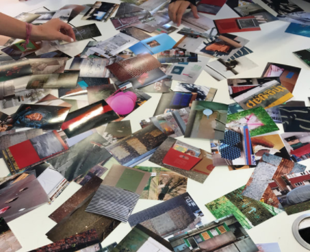
We were then put into small groups for the next part of the exercise and were asked to make a sequence of five photographs from the ones we had individually chosen. There were three people in my group, including myself, and we decided to choose our favourite photograph from our own sequence and start from there. As you can see from my documentation photographs, we then put the three photographs into their own sequence to see how well they worked together. We then decided to go back to our own sequences we originally made and identify any photographs that would work really well with the three photographs we had chosen as a group. We then came to the conclusion that because it contained so many colours of the other photographs, and we wanted something that would really contrast with the other two images, we would remove my photograph from the sequence.


After shuffling through all of our images again and being given the chance to find any photographs from the original pile that was available to everybody, we found five photographs, two from the three that we originally chose as a group. We decided to keep the original two, and place the photograph of the orange sign as well as the blue discarded furniture because they worked very well as diptychs with our first two. We also all really liked the fact that the photograph of the orange sign contrasted so much with the other photographs and made the rest of the sequence more interesting. To find the final photograph to go with our sequence, we went back to the original pile and found another quite contrasting photograph in terms of colour but did not overpower the rest of the photographs. We chose a bright white coloured photograph that was similar in terms of subject matter but contrasted the other photographs. We then proceeded to figure out the order of the rest of the photographs. We done this by simply putting together what photographs went well in terms of colour, line and shape. We tried a range of different ways to order the photographs and decided that the first image should be the photograph of the white wall followed by the photograph of the orange sign against the black background. This was because these two completely contrasted each other and it really worked. We then decided the place the photograph of the chair next as it worked well with the previous photograph in terms of colour. We then chose the photograph of the blue wall to go next as, again, it contrasted in colour and angle/focus. Lastly, we decided to put the photograph of the discarded furniture with the hint of blue next to the photograph of the blue wall because of the colour similarity.


In the last part of our challenge, we were asked to put our sequences on the wall, alongside the other groups sequences. We decided that our sequence was best to go last as that, as a class, is what we felt looked best for all of the photographs. We were then asked to photograph the line that separated two different photographs from each other, to make a whole new photograph in itself. I based my photographs purely on colour, line and shape as this is what I considered in every other stage of selecting. I think the two photographs I took were the best out of all of the photographs on the shelf because they really worked in terms of contrast and colour, which is something that really intrigues me about photography.


My Personal Investigation
My first idea:
The topic I initially chose for my personal investigation was 'Patterns and Sequences', this was because I felt that it was a broad topic so I could interpret it in a different and creative way without being so literal with what the topic entitled. I also found that it was a topic that related to everyday life, patterns and sequences are within almost every object or set of objects so I could take photographs of things that people would not usually take a second look at. Patterns and sequences can also be manipulated in various different ways, for example patterns and sequences could be found within the editing of photographs so this meant I was not restricted to one way or style of editing and photographing. After researching various photographers that have also had a similar idea to me and have taken their approach to patterns and sequences in everyday life, I then began to photograph myself.
Some of the photographers I researched were Alexander Jacques and Adam Gibbs. I was not overly influenced by Alexander Jacques's work as I am not very interested in photographing architecture and that was the main subject for him, he was clearly very interested in patterns and sequences within architecture. Although I was not overly interested by his work, I felt that I could take some ideas from how he has photographed through the fact that you could hardly tell what he had photographed in some images,
he had a way of keeping a sense of mystery and confusion to the photographs. I wanted to bring this to my approach to 'Patterns and Sequences'.
he had a way of keeping a sense of mystery and confusion to the photographs. I wanted to bring this to my approach to 'Patterns and Sequences'.


The other photographer I researched was Adam Gibbs. I was a lot more influenced by his work as I really liked the way that he took a poetic approach to photographing patterns within nature. Through his photographs, it was clear that he wanted to portray a poetic and dreamy way of photographing the natural patterns within nature. I liked the idea that he found natural patterns within nature and I wanted to also take my own approach to photographing nature as I wanted to show the contrast between artificial pattern and natural pattern.


After taking a series of photographs and really analysing them, I found that I really struggled with the topic I had chosen. I felt that I was becoming too literal with the idea "Patterns and Sequences" and was not taking such a poetic approach as I had hoped. I wanted to photograph patterns and sequences within everyday life that was not obvious just from looking, I wanted a series of images to fulfil this title so the viewer really had to think about what I was trying to achieve. I found that even after identifying this problem and taking more photographs with a new mindset, I was not feeling inspired by the topic anymore. I found myself sticking to close-up photographs and not taking any images from a distance, this is where I realised that this is a feature of my work as a photography student.
After analysing the images, some of the photographs I felt that worked were the ones used with flash. I loved the fact that it enhanced the colour of what I was photographing, it also made the texture relevant to the photograph. Although these photographs still portrayed 'Patterns and Sequences' very obviously, I felt that the photographs individually did not do this, it was only when they were placed in a sequence that they illustrated the topic. I liked that they featured the element of a pattern or sequence however they were not boring, the way I composed and framed the image meant that they were not boring or just like any other.


I also found many photographs from the series I took that I was not happy with. I felt that after comparing these photographs to the ones that I was happy with, these were very plain, basic and boring. They were too obviously portraying my topic, I wanted some element of mystery to the photographs. After analysing, I have found that it was clear I was not inspired by the topic, hence the composition being very basic and boring, and also the subject choice. I ended up trying to find anything that included patterns or sequences, it was no longer about the creativity that the topic entailed.


My final idea:
After analysing the photographs from my initial idea, and analysing the topic that I chose, I was clear about the struggles I faced and what I needed to think about when deciding what my final idea would be. When researching photographers that I am interested in and brainstorming ideas of what interests me in photography, I felt that I really needed to focus on what I enjoyed taking photographs of and the way I liked to photograph. I like to photograph close-ups and colour and I have realised this is a key feature of my work so I should really expand on this when I do my investigation. When analysing photographers and other pieces of photography, I was so drawn to the texture of each image. It is something that really strikes me about a photograph. I decided to research some photographers and their work and a photographer I have always been interested in is Peter Fraser, who we analysed previously in class when starting the personal investigation project. I found that Peter Fraser's 'Material' project struck a real passion within me. I was very interested in the way he had composed his images, and the textures that were prominent in the photographs he had taken. I loved the colour that was enhanced through the flash and because 'Material' included so much texture, I felt that this was a great starting point to an investigation on 'texture'.


Visual Literacy
First Photograph:
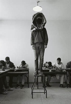
|
The initial words that sprung to mind when first looking at this photograph were: strange, dark, black hole, eerie, loneliness, outcast, symmetrical, peaceful, silence and ordinary.
The photograph is full of darkness, the head of the standing boy resembles a black hole. Although the photograph is very strange, it also has a sense of normality to it, like there is nothing out of the ordinary in the class. The main subject (the boy standing on the stool), provokes no attention with the rest of the class, it is as if this regularly occurs. The fact that the photograph is in black and white, adds to the idea of the photograph being eerie and the boys head is a black hole. |
Second Photograph:
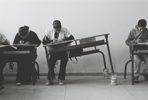
1. Simply describe what you see in the image?
The table is stood at an angle, leaning on what appears to be pain pots. The girl does not appear to be phased as she sits at the crooked table, peacefully doing her work. Nobody else appears to be phased either as their heads are down, focusing on their work. The photograph is landscape, the line of the tables would follow horizontally however the diagonal table in the middle obstructs this. although the girl is sitting at the crooked table, her legs still align with the legs of the other pupils who are sitting on perfectly straight tables. Any other assumptions about the photograph cannot be made due to the fact that the frame crops the context out. The fact that the photograph is in black and white also means that not many other assumptions can be made as there is no colour to define the tone or mood. The black and white sets quite a dark and dreary mood for the viewer.
2. What do you find unusual about the photograph?
I find it unusual that no one appears to be phased by the fact that the girl is working on an unsteady, crooked table. It is very unusual that the objects chosen to have the table leaning at an angle are paint pots. This tells me that the class must have paint pots on standby to be used for a strange situation like this instead of their actual purpose. I also find it very strange that there is not two people sitting at the middle desk. Because of the strangeness of the situation and the clear aim to make it seem ordinary, I find it unusual that the photographer has decided to only put one person at the middle desk as opposed to two people that are at every other desk. This does not keep up with the idea of this being a regular, mundane situation as it draws attention to the girl at the middle table.
3. How does the photographer use 'space' within the photograph?
The photographer uses space very strangely within the photograph. It is not symmetrical. Although many photographs are not symmetrical, some photographers would make the conscious effort to frame their photograph perfectly so that it followed a pattern. The photographer appears to have in fact made the conscious effort to frame it so that the one and a half of the students on the left are in the photograph, and only half of the student on the right is in the photograph. This is slightly unusual as it would seem obvious to crop the second student out of the left side and move the camera to the right slightly so that the student on the right is fully in the photograph. This would make the photograph symmetrical as one student from the left and right would be included. However, because the subject is very peculiar and the atmosphere of the photograph itself is unusual, it would only be right that the photograph made an unusual choice with the framing.
Portraiture
I found the challenge quite difficult as portraiture is not something I am used to photographing. I do not feel very confident or comfortable photographing portraits so I knew, as soon as we were set this task, it was going to be a real challenge for me. I decided to take the challenge within my stride and really try to overcome my issue with portraiture and find a new outlook on the genre. At first, I really struggled being confident and really getting into the task I was set but after playing with some materials and brainstorming ideas, I felt confident in what I was doing. The real problems I struggled with her composition and framing. I find it very difficult to frame and compose a portrait and having completed this task, I found that a portrait does not necessarily have to be of somebody's face, in fact it just has to be include a body part. I find face portraits particularly difficult because I do not see them as an object, I prefer to photograph still life and a face portrait is the complete opposite to this. After realising this about portraiture, I felt a lot more confident as I was able to frame the body part instead of the face of my partner. However, I really wanted to challenge myself within this task as I wanted to experiment with something I was not used to. I decided that photographing my partners face would be something that would really challenge me, but if successfully done, I would feel a lot more confident with another genre of photography. I decided to frame my face portrait head on, with objects and distractions surrounding the face. I also decided to take a photograph of my partners hands that were tied up with wire and string. I felt that these objects would distract the viewer from the main focus, adding something more to the portrait than just some hands through a railing. Overall I am pleased with the outcome of this project. I am not entirely happy with the photographs I have taken due to the fact that I had to become confident with what I was doing so I didn't get into the task straight away. However, I do feel, from this task, that I have learnt a lot of from myself as a photographer and I have gained confidence with a genre of photography that I never thought I would be.


Evidence?
I chose the hashtag #SurfaceTexture because it related heavily to my personal investigation 'Texture'. I felt that it was only right to choose a hashtag that related to my personal investigation because it would really inspire me with more of photographs I take. I was very interested in majority of the photographs that represented surface texture so it was very hard to choose only twenty images to print. I chose these photographs because these were the sort of images I wanted to be making for my personal investigation, close-ups of surface texture, enhanced colour and all types of texture. I chose to sequence the photographs this way because they all flow well in terms of colour and shape. These two elements in photograph are what I am interested in most so I often find myself categorising photographs and sequencing photographs based on this. The photographs all flow well or contrast dramatically in terms of colour and the shapes of the images work well when put in diptychs. These photographs have really inspired me as they have helped me to discover the sort of surface texture I want to photograph in my personal investigation. Sifting through thousands and thousands of images on the surface texture tag on Instagram has really given me an insight into the photographs I really want to take and do not want to take.


Sian Davey
Sian Davey is a photographer with a background in Fine Art, attending Bath Academy of Art, studying Fine Art Painting in 1985. She also has run a private Psychotherapy practice that reflects her work massively. Her work is an investigation of the psychological landscapes of both herself and those around her; her family and community are central to her work. Her two most famous projects: 'Martha (Ongoing)' and 'Looking For Alice' are documentations of her two daughters.
'Martha (Ongoing)' photographs Davey's 16-year-old step-daughter as she is growing up and 'Looking For Alice' is a documentation of her young daughter who was born with Down's syndrome. From the set of images of both projects, it is clear that Davey has a recognisable way of photographing with light and contrast being key features of her work. Light is focused solely on the subject matter, illuminating what the photographer wants the focus to be on. The high contrast of the images also helps to enhance the focus as it directs what the viewer looks at. The high contrast of the photographs and the use of natural light highlights a sense of fantasy and adds a poetic feel to both projects. This appears to be a key feature of Davey's work.
Martha (Ongoing):


Looking For Alice:


Manual Focus Photographs - My Personal Investigation
In this lesson I decided to focus on a digital camera and practicing using the manual focus. I am not very confident using digital cameras and always find myself having to ask someone to help me with the set up when using it in a certain light. Before this lesson, I was not overly confident balancing the aperture, ISO and shutter speed and I was unsure when the three settings needed to change. I decided to get some help from my teacher in how to work the three out and then decided to experiment by taking photographs inspired by my personal investigation. The photographs I have already taken for my personal investigation are all used with flash, bright colour and all represent surface texture however they are used on auto focus so I wanted to take more photographs for my investigation but using manual focus. I much prefer using manual focus when taking photographs, especially because I take a lot of close-ups shots and the manual focus gives me a lot more control over the camera and I can choose what is in focus and what is not. After being given all of the information on the aperture, ISO and shutter speed, I am able to make conscious decisions about if I want to over or under expose an image to how I like it. I think this lesson has really helped me to gain more control when taking photographs and I feel that I can make a lot more decisions and choose the way I want a photograph to come out through the manipulation of these three settings.


My First Outcome
Taking my photographs:
When taking the images for my first final outcome of my Personal Investigation, I kept in mind that I was really trying to document texture of materials through my photographs. I wanted the viewer to be able to really grasp the texture of the photograph and feel as though if they touched it, they would be able to feel the material of the subject. Using flash photography really helped me to achieve this as it enhanced all of the textures of each object or material I photographed. It illuminated the object so that the viewer was able to view the surface texture as they would in real life. When doing my project on 'Patterns and Sequences', I realised that I really did not want to take photographs so close up that the subject I was photographing was unable to be understood. I wanted the viewer to be interested by the composition of the subject as well as how I presented the surface texture. Instead of taking photographs that could be mistaken for background images, I made the conscious effort to photograph close enough to really grasp the texture of each image, but not that close so that you cannot picture what the subject is. I found myself very interested in how shadows played a part in my images. I was fascinated by the contrast of light and dark and how that helped to present the surface texture.


Selecting and editing:
When narrowing down my images and selecting the ones that could potentially be included in my first final outcome, I aimed to choose the ones that when a viewer looked at them, surface texture would be something that came to mind first. Not only this, but the ones that were composed well and were of interest without thinking about surface texture were the ones I thought more about. I felt the need to be strict with myself in choosing what photographs met my criteria as in past projects, I feel I have not done this. I found that I veered away from choosing the photographs with the most amount of colour which, for me, is unusual as colour is usually what strikes me most about a photograph. I was pleased with this process as I found a different in the way I was working and the way I was critiquing my photographs, I felt I was being honest with myself and not falling into my usual habits of colour and close-ups. I am very pleased with how much my set of images reflect Peter Fraser's work as my initial inspiration for 'Surface Texture' came from his project 'Material'.


Final six:
When narrowing down my images, again, I aimed to be very strict with myself in the images that I wanted to make the final cut. I wanted my images not only to work well individually, but I needed them to work well as a sequence. This was because I had the plan to put my images on to wooden 3D board/boxes whereby they would be individually standing so the sequence could vary depending on the viewer. I wanted the sequence to work together mainly in terms of colour, contrast and tone as well as the types of texture I had photographed. I was very happy with the overall sequence of photographs as I think it was a clear representation of my title and how I wanted to document surface texture.


Printing of the final six:
I decided to print my six images onto card and then pin and glue them to four square boxes I had made. To make these boxes, I used blocks of wood, cut them in an angular shape so that they would fit together properly and then nailed them. I then used black paint to paint them and then left them to dry. I then stuck the printed images onto some card and used spray mount to glue them onto the boards. I decided to print my images onto the wooden blocks as I wanted the images to be more than just a printed image. I wanted them to be texture themselves. Using the wooden blocks allowed the audience to interact with the photographs and allowed them to feel them without just being printed images on a wall. They were a form of texture for the viewer to feel and understand.


Placing images in different surroundings:
I initially decided to photograph where I felt the photographs would fit strangely into their environment. The bright green wood of the 'Deliveries' shed helped to really make the photographs pop and stand out. I decided to place the photographs in a non-orderly sequence so that they looked out of place and as though they should not be there. I also decided to take the photographs of the environment in a way that captured the elements surrounding the images so that you could really see what space they were in. I wanted variation in the documentation of the space, so I decided to photograph in ways that showed this. I took photographs that showed the images clearly and also photographs that showed the environment more clearly. I really like how these sequence of photographs have turned out because although the final piece are to do with texture and colour, I think the photographs of this surrounding portray this too.


For my next surrounding, I decided to photograph my images on the metal stairs in school. I really like the way these photographs have turned out, mainly due to the lighting and positioning of the blocks. The warm light of the sun and the shadows created by the metal stairs are what attracts me most to this set of images, especially the first image. To make these photographs, I decided to stack and place the 3D boxes in various positions in order to show how the photographs worked together in a sequence within a very normal environment. I wanted to place them so that they were one piece, not so that they were separate photographs, you can see this from the first and third image. I also wanted to contradict this idea and place the blocks at different levels on the stairs and photograph them through the railings of the staircase so that the final image would appear as though the viewer has just come across the blocks.


For my final surrounding, I decided to photograph the images in a more rural, natural setting. I wanted to photograph them in a way so that it was as if the viewer has just come across a load of photographs that were in a strange, unnatural environment to where they would presumably be. I placed the images so that it was as if the photographer had wanted them positioned in a certain way, yet
to the viewer, the images were out of place amongst the tree trunks. I am very pleased with the documentation of the blocks in this setting as I really like how the two elements contrast each other. Although very similar; photographs of everyday, mundane objects placed within a very everyday, mundane setting, the two contrast each other immensely. It is very unlikely to find a set of printed images on handmade blocks placed within a load of tree trunks, I am intrigued and hope the viewer would be intrigued by the contrasting elements of this.
to the viewer, the images were out of place amongst the tree trunks. I am very pleased with the documentation of the blocks in this setting as I really like how the two elements contrast each other. Although very similar; photographs of everyday, mundane objects placed within a very everyday, mundane setting, the two contrast each other immensely. It is very unlikely to find a set of printed images on handmade blocks placed within a load of tree trunks, I am intrigued and hope the viewer would be intrigued by the contrasting elements of this.


Controlled Assessment
To finish our final pieces for Component 1, as a class, we were given ten hours over two days in order to complete this task. During this time, I completed all of my editing for my photographs, I selected the ones I wanted to include in my final installation, I ordered all of the varied sized prints online, and remade the six blocks I used for my first draft and repainted them so that they were ready for new images to be glued on. Not only this, I also planned where I wanted my installation to be, how I would achieve this and why I chose to do this in the first place.
For my installation, I selected thirteen photographs. I printed two of my images A1 size, another two at 16x12”, another three at 10x8” and then printed the rest of my images at 8x8”. I used the six boxes I had made originally, however I wanted to print new images onto the boxes as I had chosen more images than before. I bought five frames, two to fit the 16x12" photographs and three to fit the 10x8" photographs. I decided to stick the two A1 images diagonally up on the wall with all of the other images scattered on top. Because my project was about texture, I felt that this installation would really emphasise this idea. Having the photographs printed at different sizes, different shapes and different widths in their frames would demonstrate my theme of texture and how it is significant in everything.
When making my installation, I wanted to touch upon another idea I had thought about too. When you look at a thing, you don't just see the thing. Of course with photography you are able to choose what you photograph and what you include in an image, but in the world, you don't just see one thing at a time. Often, you see the thing next to it or the thing behind it. Or even if you can only see the thing in front of you, your experience with it makes you think of another thing. This is why I chose to present my images in this way.
To demonstrate how everything in the world connects, connotations of things and personal experiences mean that everything connects and overlaps. Just like the images in my installation.


| My Personal Investigation Final Essay |
